
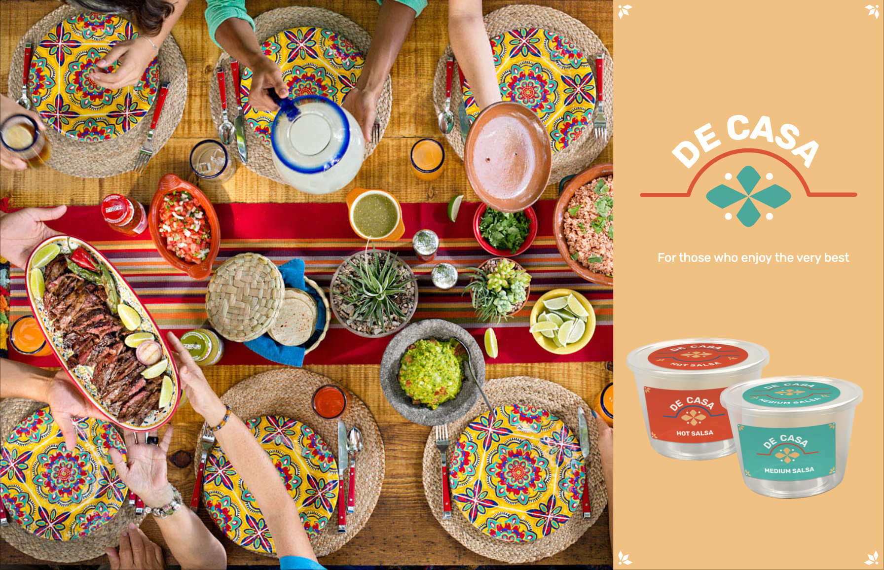
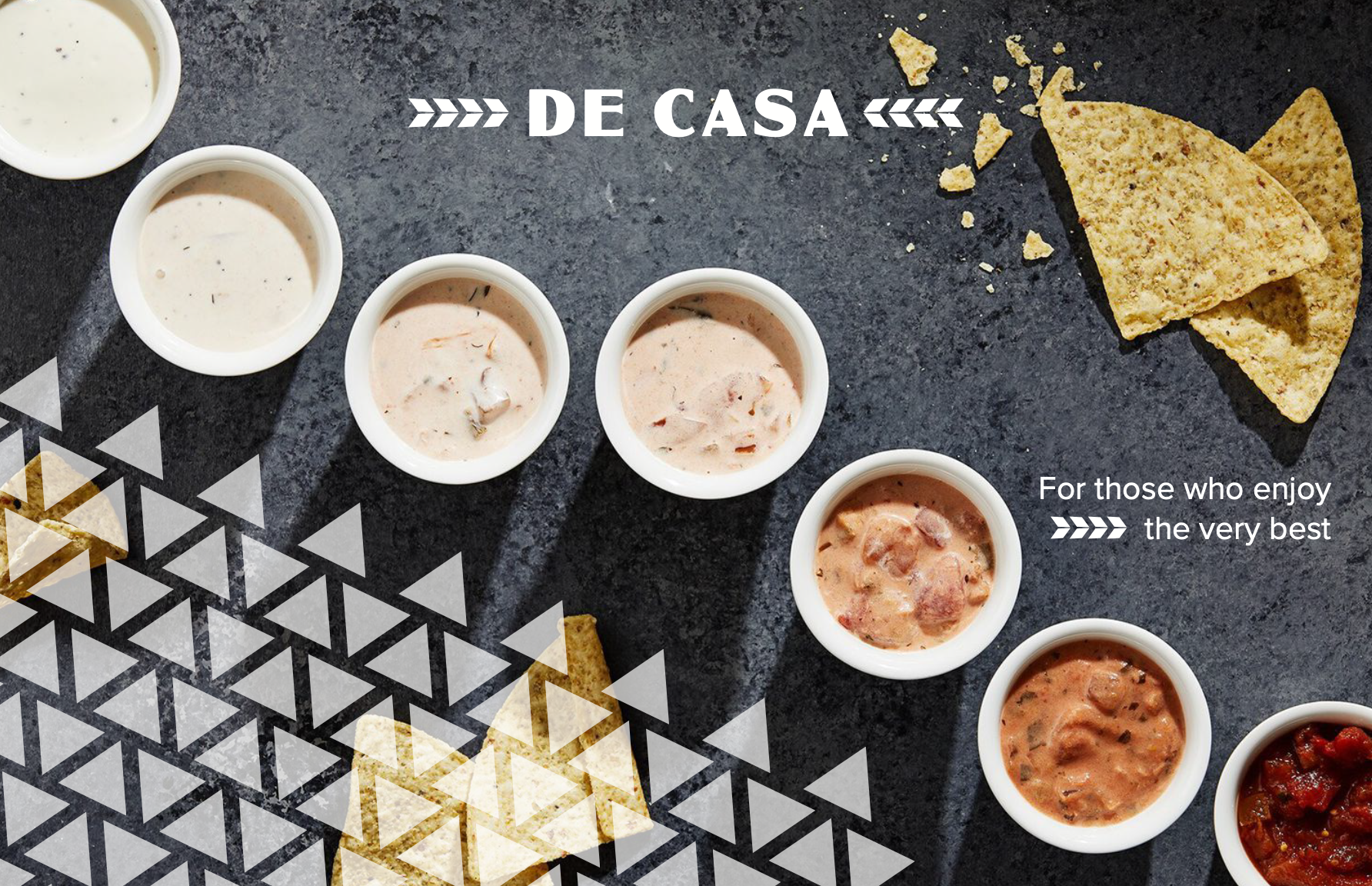
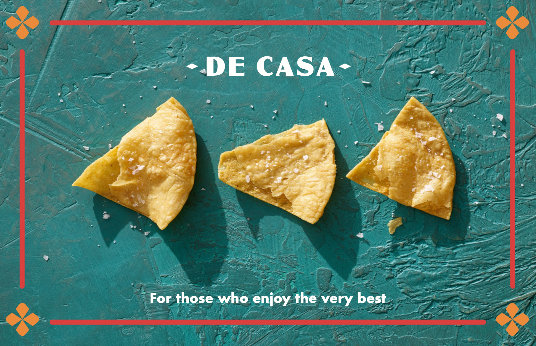
De casa
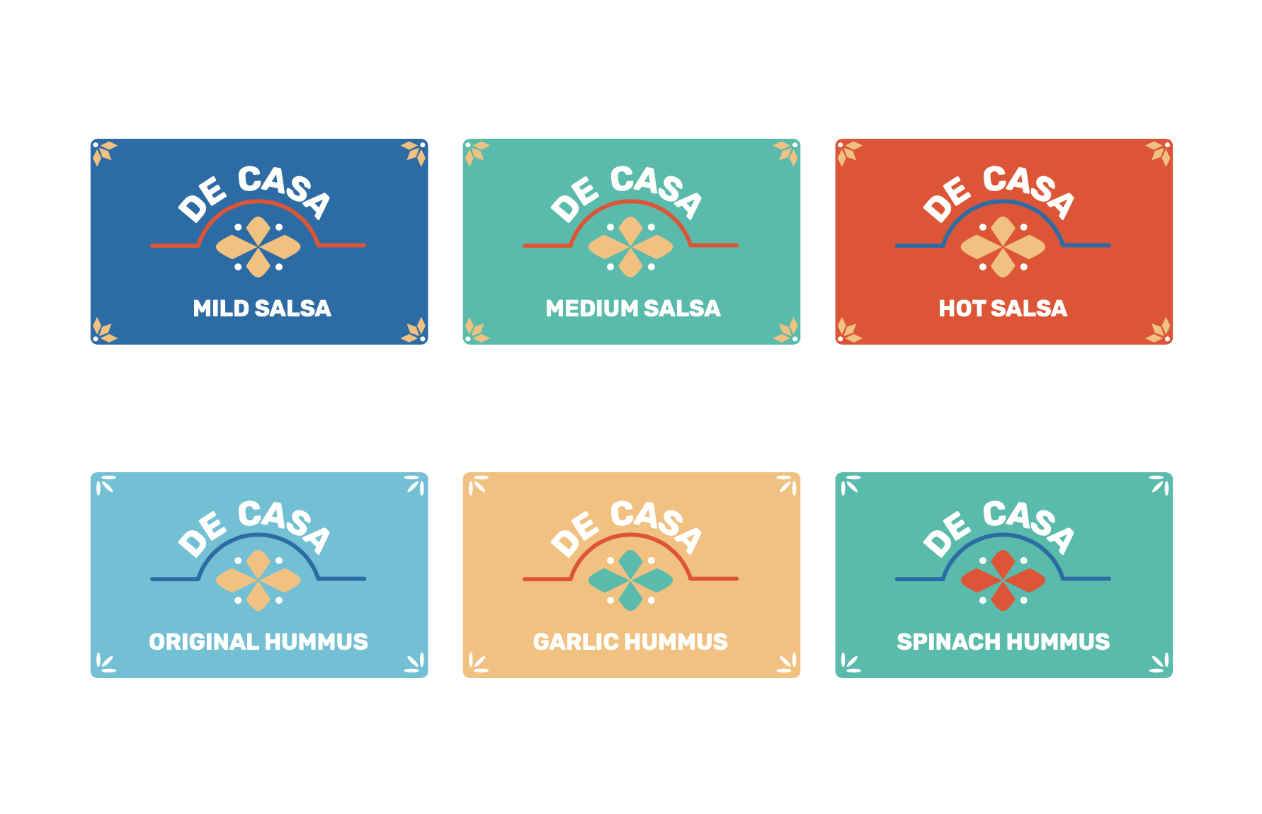
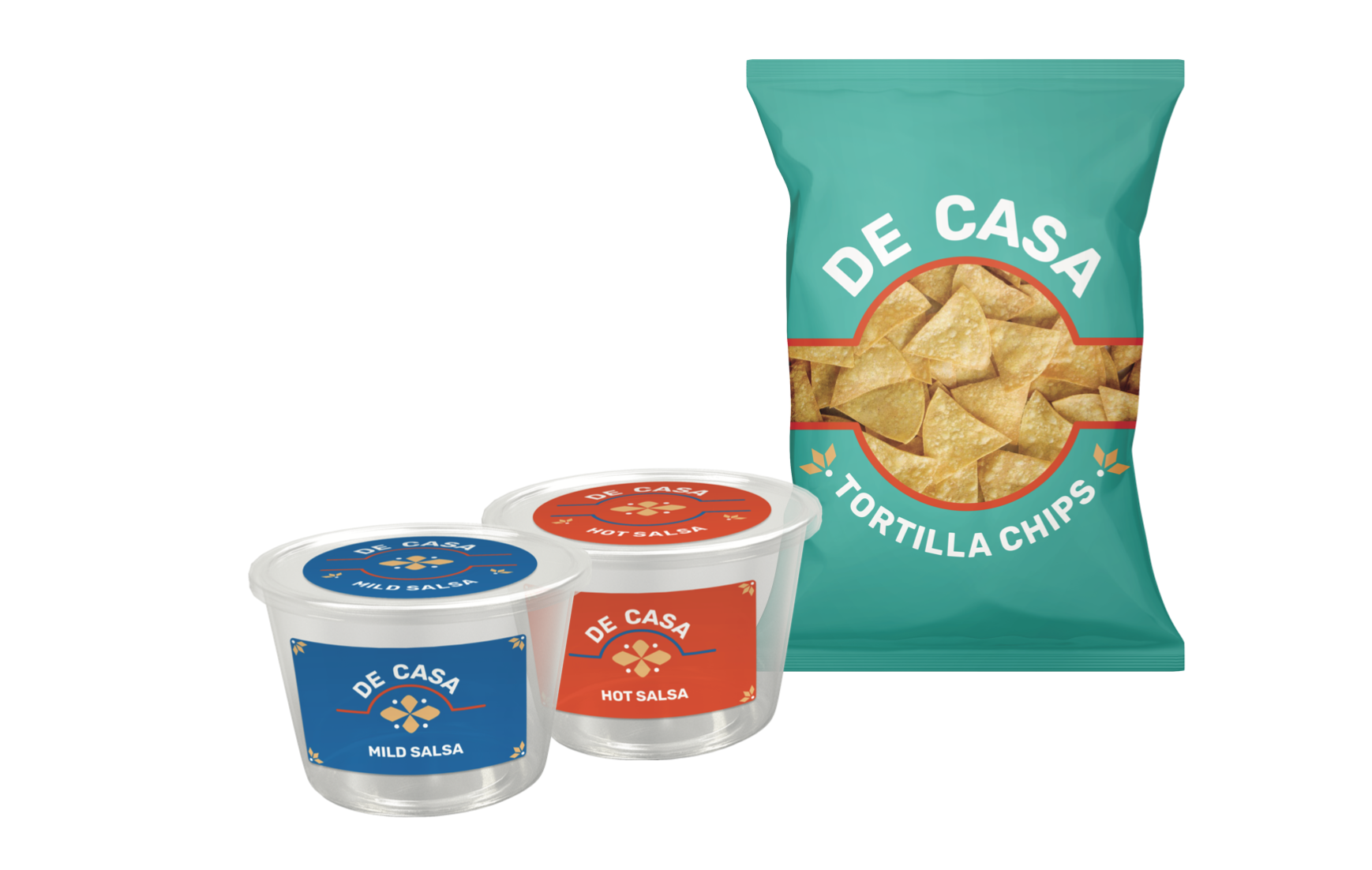
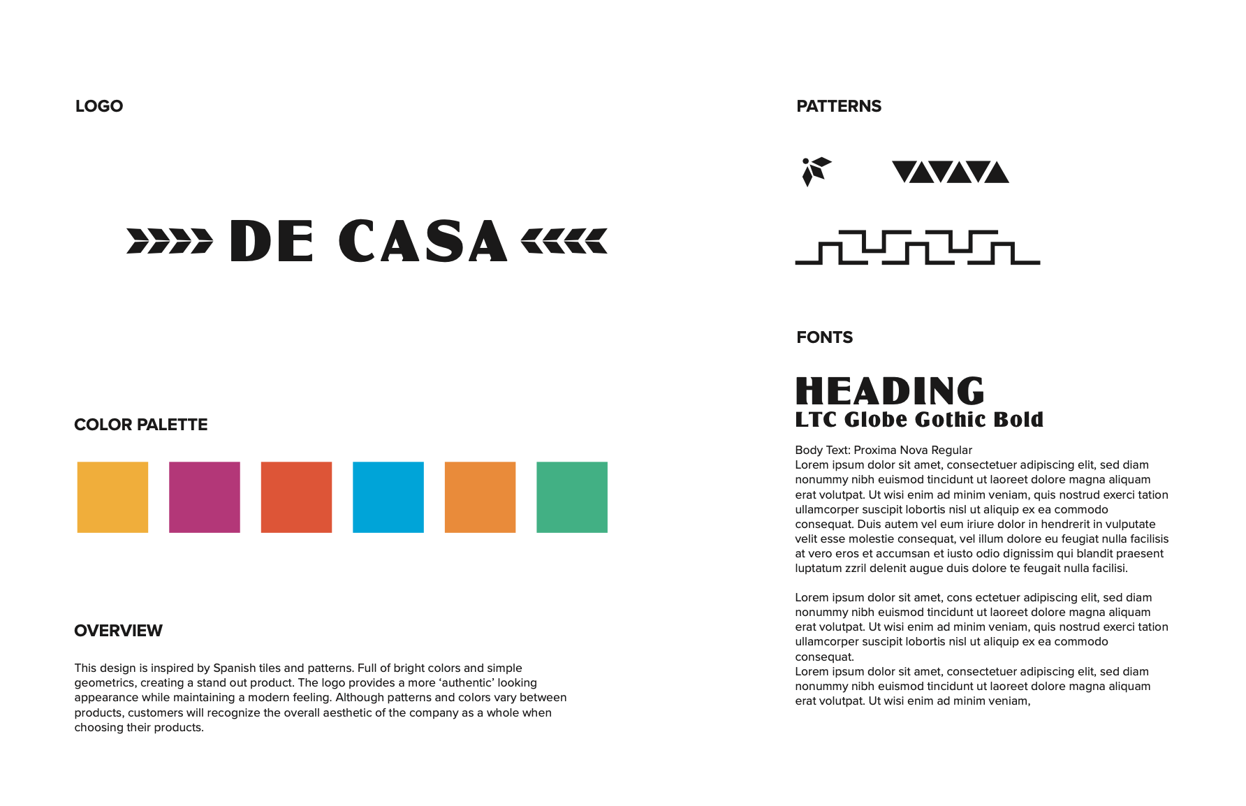
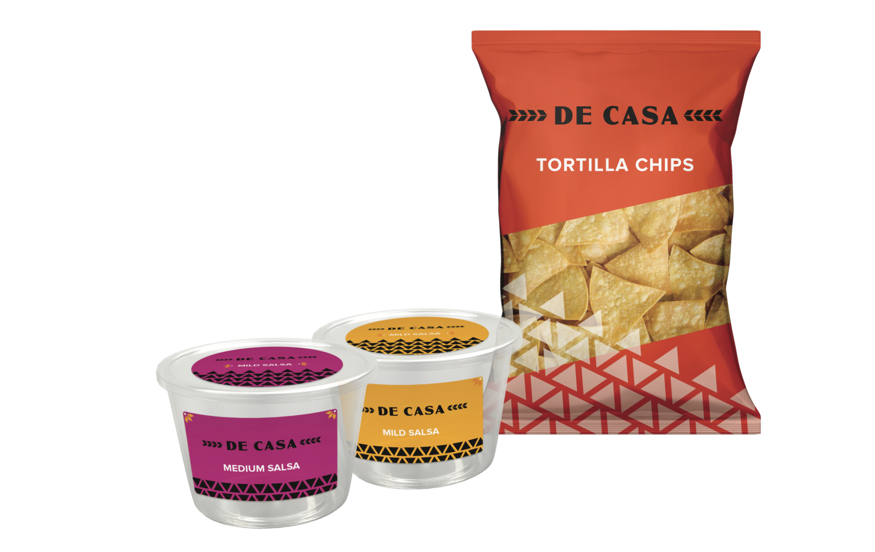
My work for De Casa included a full rebrand and update to their current identity. I presented two different brand proposals that included a mood board, example labels, packaging mockups, and a potential advertisement.
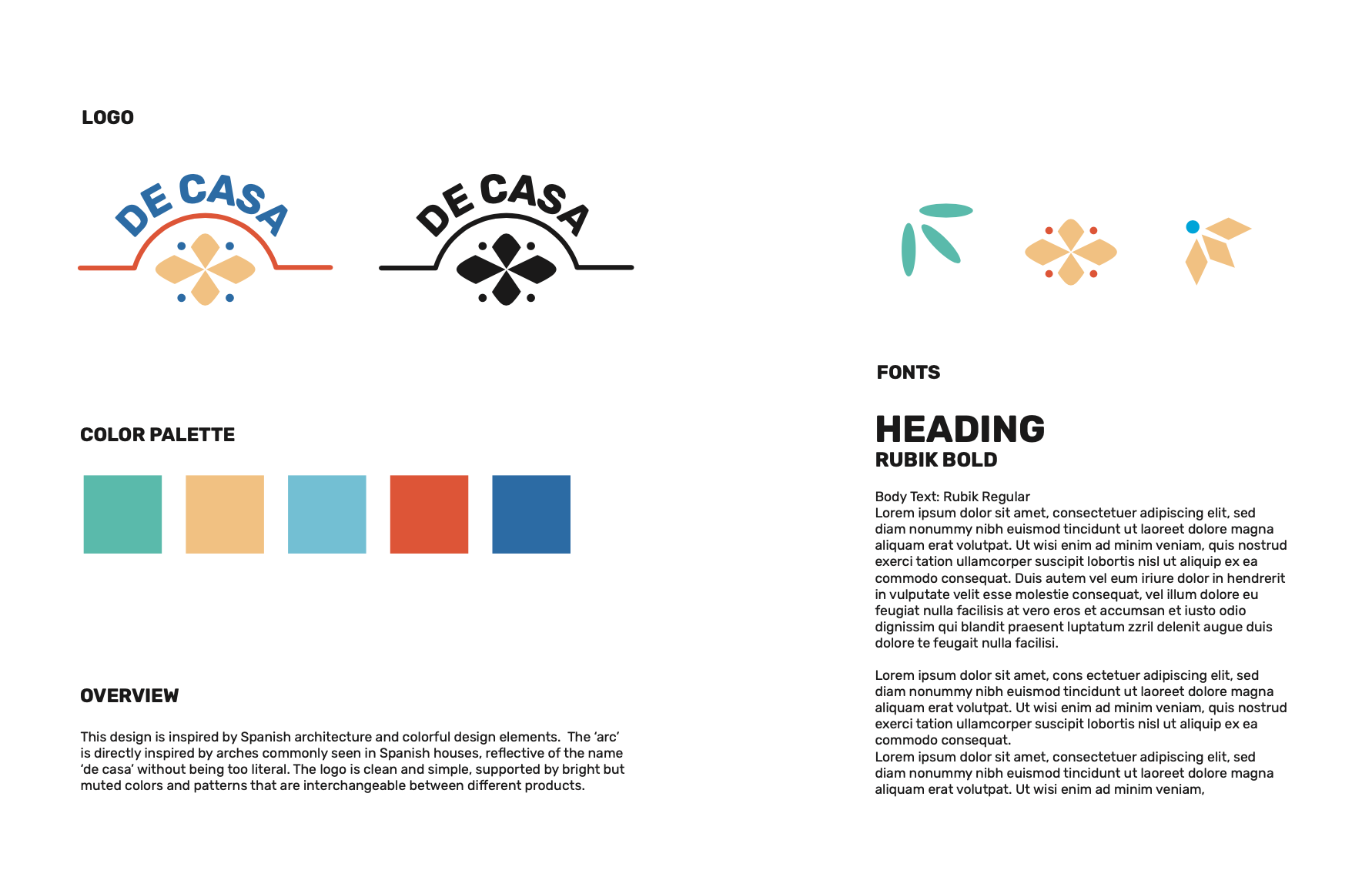
My first design was inspired by Spanish architecture and colorful design elements. The ‘arc’ is directly inspired by aches commonly seen in Spanish houses, reflective of the name ‘de casa’ without being too literal.
The second design is inspired by Spanish tiles and patterns. Full of bright colors and simple geometrics to create a stand out product. The logo provides a more ‘authentic’ looking appearance while maintaining a modern feeling.